
LFS 4x4

Overview
As our rebrand was rapidly approaching I was asked to form and lead a small design team (2 designers, 1 developer) within LFS, our objective was to redevelop the visual language of our core website. To setting the tone and visual patterns for consistent application across all sub brands and other web assets. Over the course of four, week-long sprints, our goal was to make a bold change in visual style, leveraging the newly established brand guidelines—incorporating new colours, photography, typography, and visual elements. This project involved frequent senior stakeholder engagement through open showcases, which took place on the walls within Latitude's open plan office in Docklands. This helped to keep things visible to all, foster frequent feedback and ensure cross-team engagement and business alignment.
Setup
The project kicked off with collaboration across the Brand, Marketing, and Design teams. We began by gathering inspiration to establish the tone for the rebrand. This was organised visually in an "inspiration wall" situated in the Level 3 halls of our office, right next to the rebrand team pod. This wall served as a dynamic collection of ideas, which evolved into our own iterations on parts of the execution as the project progressed. New concepts and ideas were continuously added, while others were refined or replaced to match the project's direction.
Constraints
Several key constraints shaped the design process:
Time constraints: Given the tight timeline of just four weeks from ideation to delivery, our first priority was to focus on the most frequently accessed pages and core product offerings. This approach ensured that we could make the biggest impact with the resources available.
Reusability & iteration: While we introduced new design elements and components, a major focus was on iterating and reusing existing design patterns. This helped optimise resources and maintain consistency across our web assets.
Cross-team collaboration: The visual changes had a broad impact across the organisation, requiring detailed engagement with many other teams. We needed to ensure that the new design language would be compatible with ongoing projects, existing user journeys, campaign content, and internal websites.
Limiting impact on Existing Components: Our engineering team played a crucial role in ensuring that the rebranding would not disrupt the existing website elements. We aimed to create a balance between introducing new design elements and minimising tech debt, ensuring that the changes could be implemented efficiently and iterated on progressively beyond the scope of the design sprints.
Design Process
Week 1: Fast Iteration and Early Prototyping
In the first week, our team’s focus was on quickly iterating on common design patterns. We divided existing web pages into common components, with each designer responsible for a set of patterns. We adopted a collaborative, fast-paced approach where daily reviews, walk-throughs, and critiques helped refine our ideas. Mini proof of concepts were tested with various designs to identify the strongest direction forward.
Weeks 2-3: Refining and Expanding Key Patterns
During weeks 2 and 3, we worked on constructing rough versions of key patterns for the core product pages. Each designer focused on their assigned key pages, while collaborating on shared patterns. This phase involved testing different iterations and refining patterns to create a consistent visual language across the site. As patterns began to take shape, we started aligning them with specific pages and products to ensure cohesiveness.
Final Week: Consolidation and Finalisation
The final week was dedicated to consolidating our work, refining rough designs, and ironing out visual inconsistencies. Our primary objective was to establish a cohesive set of patterns that could be scaled across all future web assets. We also focused on finalizing the visual style by resolving any complexity in the designs and ensuring consistency across breakpoints.
Delivery
By the end of the project, we delivered the following key assets:
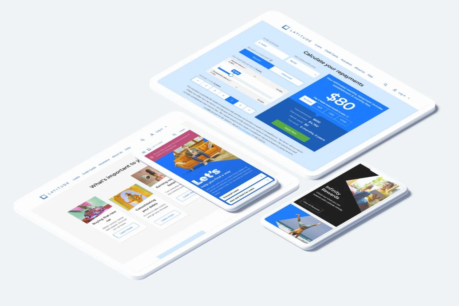
8 Redesigned Key Pages: Each of these pages was optimised across all common breakpoints (desktop, tablet, mobile).
Design Patterns: 9 new design patterns were introduced, while 12 existing patterns were revised to align with the new visual language.
Components: A total of 194 existing components were revised to fit the updated design system and 15 new components were created.

A sample of reworked elements on mobile
Post-delivery debrief and learnings
After the initial work was completed, we held debrief sessions with stakeholders and the entire design team. This provided an opportunity to review both the successes and challenges of the project, share insights, and discuss the next steps for broader implementation. We also identified areas that required deeper development and prioritised changes to the design system to ensure it was adaptable and scalable for future use across all web assets and content.
Conclusion
This project marked a significant shift in the visual language of our website, creating a unified and modern design system. By collaborating closely with internal teams and maintaining a focus on efficiency and reusability, we were able to achieve a cohesive, scalable design that could be extended across various web assets. The iterative process ensured that we made steady progress despite time constraints, delivering impactful results that aligned with the rebrand's objectives.